Wednesday, August 31, 2016

My 2nd Round Entry Process

I thought I would use my recent Global Talent Search entry "Naked Cake" & talk a little about my digital painting process and brainstorming.
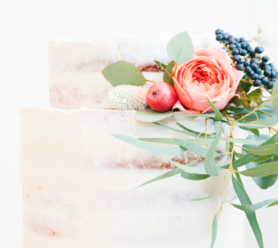

Ever since participating in the 100 Day Art Challenge, I have been painting more flowers digitally. Some coming from my imagination & some from reference to achieve a higher level of contrast and more descriptive form. When I set out to come up with my cover design I wanted to pick a dessert image that I could incorporate some flowers into the design. I researched desserts that were a bit more trendy and came across the "Naked Cake". (Below is an example of the beautiful way of decorating this layered cake). I was also drawn to the soft pinks and greens found in this image.


Inspiration
In looking at various examples, the cakes that had little to no icing were the ones that I was most attracted to. All naked cakes have an icing or fruit filling on top of each layer. I started sketching and came up with my cake composition. I was drawn more to the simple and elegant arrangements which is why I decided to only add a couple of flowers and leaves to the top of the cake and have the berries arranged on the bottom. 

Brainstorming
I first brought my sketch into Adobe Illustrator and created most of the shapes in the composition including the cake and jar. The Illustrator file was exported as a Photoshop file(keeping all the layers) and I then began to paint using the shapes as guides. I have gathered a big variety of digital textured brushes and round brushes over the years, and they came in handy in trying to create the icing and cake. Below is an example of the texture of some of my favorite brushes and brushes I used for the icing.

Textured Brush Samples
The most fun was painting the flowers. For the Chrysanthemum, I started with a very simple vector shape, that I filled with a light pink and then in Photoshop started painting in color, building all the many petals shapes inside of this complicated flower. I mostly used my favorite Round Point Stiff Brush for most of the detail, along with the hard and soft round brushes. Once the color and shape was painted, I used the Smudge Tool to smooth out and blend the color. For crisper edges, I used the Pen Tool to create the highlight shape and then added the color inside the selected shape. After I finished the initial painting of the flower, I then duplicated it and used Photoshop Blend Modes to change the chroma and contrast of the painted marks. One of the last steps I took, was to use a textured eraser tip and subtlety erase pixels to make it look a bit worn and softer. Below shows an early detail of the flower during the process, original reference as well as the finished flower.


For the background, I kept it more simple and light, in an effort to add an overall elegance and sophistication. My vision of Sunny's Cafe is that of a hip, sophisticated cafe that might exist in busy cities like New York or Paris. The border I created was inspired by these trendy storefronts. It might be hard to pick up from the monitor but there is also subtle texture patterns in the background of the book cover, I like added textured nuances but in this case, did not want to detract too much from the main focus of the cake. I really enjoyed painting this cover image and taking my time with each stage to experiment more with what I can create with my digital brushes.


I would really appreciate your kind Vote!


I would really appreciate it if you could vote for my cover and share this link!! This is an amazing opportunity for me to get a major boost for my illustration career and potentially win 2 years of representation from Lilla Roger's Studio, truly a dream opportunity. Here is a link to the description of the prizes won by the Grand Prize winner,http://www.lillarogers.com/global-talent-search/prize/

Click here to vote:http://www.lillarogers.com/wp-content/plugins/lilla-rogers-gts/viewimg.php?img_id=3585&post_id=25882

Voting ends Monday 9/5. 
Thank you for your time and support. 

Monday, August 29, 2016

I made it to the 2nd round of the GTS 2016

I am taking part in the Global Talent Search 2016 by Lilla Rogers’ Studio again this year and recently found out recently found out that my entry was selected to move on to the 2nd round of the competition! This is the third year that I have been fortunate to make it into the top 50. I am so excited and honored to be amongst this group of amazingly talented artists and illustrators. Check out the entries that made it into the top 50 by clicking here. Below is mine.


The brief this year was to design a teacup & saucer and paper napkin in my own style for our fictional muse Sunny. Sunny has just opened a new cafe and is interested in purchasing a tea service that fits her style and vibe of the cafe. 

We were able to  approach the assignment anyway we wanted to,to showcase our illustration style and concept. I chose to spotlight a single cup and saucer and set it up as if the cup was waiting to be sipped. Since it was a cafe with an emphasis on desserts I thought I would add a bit of chocolate and a used tea bag to set the scene.

I first started with as sketch that I scanned into Photoshop and then using my trusty PS brushes I began to paint my little tea cup to bring it to life. My current style (when dealing with subject matter that is not kid oriented) has evolved into a combination of some realistic elements, like the painting of the song bird featured on the left side of the cup with more stylistic elements, like the flowers and background. I enjoy developing subtle texture to weave throughout the image.


I have been trying to add more hand drawn type and was pretty happy with that addition on the base of the tea cup. The color palette was a bit of a departure for me but lately I have real been drawn to hotter pinks and blues. I still paint exculisely using my computer mouse, but I trying to wean myself of ruling on the mouse so much and use my Wacom tablet more so I can use all the wonderful brushes I purchased from Kyle Webster at the recent ICON 9. I really enjoyed this project and so honored to move through to the next round.

Wednesday, August 3, 2016

100 Day Challenge

I recently signed up to participate in #The 100 Day Challenge with Elle Luna & The Great Discontent. The 100 Day website defines the challenge as a celebration of process that encourages everyone to participate in 100 days of making. The great surrender is the process; showing up day after day is the goal. 

A few days before the challenge began, I noticed on Facebook that a few artist friends had posted that they were planning on participating in the challenge and that was the only spark I needed to sign up myself. Before making this decision, I did not think through my schedule  for the 100 days of the challenge or the actual scope of the project in which participants post a new work everyday for 100 consecutive days. I am glad that I did not because I most likely would not have signed up, missing out on one of the truly enriching art projects I have had.


I posted on both Facebook and Instagram each day and was truly humbled by the kind support of friends and followers that commented and liked my daily posts. That energy gave my the drive and confidence to continue to post each day, even when my day was crazy busy or I had a dreaded creative block. Considering the nature of this challenge, it felt great to still post even though at the time I wanted to cringe at what I posted, but ultimately, it was so liberating to just let it go--subjective "flaws" and all.


Every participant could chose their own project objective and I chose the hash-tag "LittleArtThe100DayProject". For my challenge I decided to create a postcard size, digital painting using Adobe Photoshop. For Facebook, I posted a 4x6 image and created a separate image to post on Instagram that fit in the standard square format, which sometimes required an extensive reworking of the image. To help me come up with my daily content I decided to let the alphabet guide my imagery. I averaged between 4 to 3 images for each letter, starting with the letter A and ending with Z. This also gave friends and followers a fun dialogue to help with ideas that spurred me on with every new post.


I would basically start out the same way with every new painting, I would brainstorm ideas at night before falling asleep, do a bit of research in the morning and start sketching. After sketching I would take a photo of my sketch, post it to the CLOUD and finally bring it into Photoshop to paint away with custom brushes and textures that I had previously made. There were days that I was so swamped with other obligations that I could only rework some of my older work to make it new and fit with the challenge objectives. Although, for the most part, I could finish each piece within my allotted time frame each day, there were some pieces that I worked on for a bit longer and would post the next day.


Here are the 100 paintings that I posted on Instagram starting on April 20, 2016-July 27, 2016. What a great experience!  


Tuesday, March 15, 2016

Bootcamp is Back!

MATS Bootcamp is back and our first MINI - sketching time before the main assignment, is all about hair, specifically hairstyles of the 1920's. Below is my sketches from the MINI. In looking at them all, I think I was just as excited to draw the exaggerated eyes and eyeliner as I was to draw the hair. Fun to be drawing faces again. Can you guess what the main assignment is?


Tuesday, March 8, 2016

MATS Spring Home Decor Course


It is finally thawing out here in Wisconsin but during the cold winter I was busy taking the Make Art That Sells Home Decor Course for a second time. I loved it so much the first time that I had to take it again. The course is team taught by top art agent Lilla Rogers & Margo Tantau the Creative Director @ Midwest-CBK.

Class was just as intensive this time around with one assignment per week using a different substrate to create a comprehensive home decor collection. For each assignment we were asked to create pieces featuring products made from metal, fabric, glass, ceramics and wood/MDF. 


Below are the 5 collections that I created.


There were three mood boards that we could choose from to use as inspiration for the five assignments. The mood board I chose this time was called Farm Fresh. We could use the board for inspiration in any way that we wanted. Although influenced by the theme, I used the mood board mainly to help develop my color palette for my collections. 

Once again the iconography from the previous weeks overlapped so that by the final week we had a varied yet cohesive collection.

The subject matter was similar to the first class and that presented an exciting challenge for me to come up with icons and designs that were new but also worked with my collections from the first class. My ultimate goal is to put together a couple of portfolio pages using pieces from all ten assignments. 

Just like the first time, the 5 weeks of class really flew by and I was very sad when it ended. This class is a pure joy, I have learned so much about this market and how to present my work and ideas. Thanks again to both Lilla and Margo! And a big shout out to the Facebook community of amazing and talented artists that make the class fun and dynamic and great place to share and learn!